Create dynamic social card images with Svelte components
This post was updated in January 2024 to use SvelteKit's new read method to read font data on the server.
When you share a blog post or site on social media, the first thing most people will see is a social card image, or "og:image". Adding one of these can massively increase the number of people who engage with your post. In the past, you either had to manually create these images or automatically generate them with a headless browser or service. However, Vercel recently launched a library that makes generating these images easier, faster, and cheaper. In this post, I’ll show you how you can use that library to generate social card images using Svelte components. Even though I’m focusing on Svelte, the concepts should transfer to any component framework that you can render to an HTML string.
What is og:image? permalink
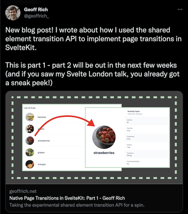
A deep dive on this is outside the scope of this blog post, but I’ll give the tl;dr. An og:image is a type of <meta> tag that you put in your site’s <head>. Social media sites will use this information to display the given image when you share that URL. For instance, one of my recent blog posts looked like this on Twitter:
Swyx has a blog post that does a good job explaining what they are and why you would want them on your site (though the information around generating them is out of date).
While there are other meta tags to display information like title, author, description, and so on, we’ll focus on the image today.
Previously, if you wanted an og:image on your site, you had a few options:
- you could choose a single static image to show for every page on your site. This was easy, but boring.
- you could create an image for each page manually.
- you could use a hosted service like Cloudinary to do it for you.
- you could automate og:image generation using Puppeteer to take screenshots of Headless Chrome. This let you write your templates as HTML and CSS, making it easy to update your template, but it could be slow. Chrome is also too large to fit in a serverless function, so you couldn’t host on common providers like Vercel or Netlify. GitHub uses this method to generate social share images for repos, issues, and PRs, but they also had to work around performance issues
In the past I tried using Puppeteer to generate my images, but ran into issues running locally (granted, I was on an old version of WSL at the time). I currently use the second option—I have a Figma template and update it for each post. This works, but it’s tedious. It is also time-consuming if I ever wanted to update my template for all previous posts. Some of my older blog posts still have an old card design that I don’t like but I haven’t updated them due to the time commitment.
Wouldn’t it be nice if there was an automated solution that was fast, easily deployable, and that could be configured using modern component syntax? Well…
Introducing @vercel/og permalink
Last week Vercel launched a new library to generate social card images. Instead of spinning up headless Chrome and taking screenshots, this library library converts HTML and a subset of CSS into images. This makes for a solution that is easier (you’re just writing HTML), 5x faster, and 100x more lightweight than running headless Chrome. For more tech details, see this Twitter thread by creator Shu Ding.
When I saw this my first thought was: how can I use this in SvelteKit, and with a Svelte component? Since I use Svelte for my personal projects, it would be a very nice dev experience to write my social images in Svelte.
Unfortunately, all the official examples use JSX syntax and I didn’t want to take a dependency on React. But it is possible—you just have to wire some things together. Here is what we’ll be working with:
- The key dependency here is Satori, the underlying library powering
@vercel/og. It does the hardest part: taking HTML (well, JSX) and turning it into an SVG. It only accepts JSX, so you can either manually create React-like objects (e.g.{ type: div, props: { children: "Hello world" } }), or you can… - Use satori-html, a library from Astro’s Nate Moore that will turn an HTML string into an object Satori can use. You can write the HTML string manually, but we’ll be generating it from a Svelte component instead.
- To get the HTML string from the Svelte component, you can import the component on the server and call
.render()to get the HTML representation. This is possible via Svelte’s server-side component API. This step is also very performant, since rendering a Svelte component server-side is just string concatenation. - Finally, once we create an SVG from the HTML string using Satori, we can turn that into a PNG using resvg-js.
So the code for this ends up looking something like this:
const componentResult = component.render();
const htmlString = satoriHtml(componentResult.html);
const svg = await satori(htmlString, satoriConfig);
const image = new Resvg(svg, resvgConfig).render();
return new Response(image.asPng(), {
	headers: {
		'content-type': 'image/png'
	}
};
While the details here can get a little tricky, that’s not a lot of code! The pipeline ends being: Svelte → HTML → JSX → SVG → PNG. Whew!
(There might be a way to use @vercel/og directly with the same satori-html transform. This would give us less to implement, since @vercel/og will automatically construct a PNG response and allow you to use emoji, other languages, and Tailwind CSS. However, I ran into WASM errors when running locally with Vite. Vercel also specifies that @vercel/og is only compatible with the Edge Runtime.)
With the overview out of the way, let’s drill into the details.
Warning: both Satori and satori-html are pre-v1, so there could be breaking changes. This demo has been developed with
satori@0.10.11andsatori-html@0.3.2.
Getting started permalink
To follow along, create a new SvelteKit app following the instructions on the SvelteKit homepage. Select the skeleton project template when prompted. I’ll be using JavaScript (with JSDoc) for this post, but you can select TypeScript if you like.
npm create svelte@latest sveltekit-og
cd sveltekit-og
npm install
npm run dev -- --open
We’ll need a few dependencies, as mentioned above:
npm i satori satori-html @resvg/resvg-js -DSatori also requires you to BYOF (bring your own fonts). It will use the raw font data to render any text to SVG paths. For this demo, download the Noto Sans font from Google Fonts. Unzip the folder and place the NotoSans-Regular.ttf file inside a folder at /src/lib.
Now that we have all the dependencies, let’s create a server endpoint that will generate OG images. We’ll start small, and just pass a "hello world" string for now. Once we get the basic image generation setup working, we can add a Svelte component.
Create a new file at src/routes/og/+server.js and paste in the following code:
import satori from 'satori';
import {Resvg} from '@resvg/resvg-js';
import NotoSans from '$lib/NotoSans-Regular.ttf';
import {read} from '$app/server';

const fontData = read(NotoSans).arrayBuffer();

const height = 630;
const width = 1200;

/** @type {import('./$types').RequestHandler} */
export const GET = async () => {
  const html = {
    type: 'div',
    props: {
      children: 'hello, world',
      style: {color: 'red'}
    }
  };
  const svg = await satori(html, {
    fonts: [
      {
        name: 'Noto Sans',
        data: await fontData,
        style: 'normal'
      }
    ],
    height,
    width
  });

  const resvg = new Resvg(svg, {
    fitTo: {
      mode: 'width',
      value: width
    }
  });

  const image = resvg.render();

  return new Response(image.asPng(), {
    headers: {
      'content-type': 'image/png'
    }
  });
};
This creates a SvelteKit server route that will generate OG images for us. We're using SvelteKit's read function to retrieve the raw font data. For more on how this function works, see my post about it.
This post originally used a custom Vite plugin to retrieve the font data since it was written before the read function existed. If you're using a SvelteKit version that doesn't support read (<2.4), you can reverse the changes in this PR to get back to the old method.
With that change, you should be able to run the app and navigate to /og and see the generated "Hello, world!" image.

Wiring this up to a Svelte component permalink
Now that we have the basics working, let’s generate our markup from a Svelte component instead. Create a Card.svelte file inside the src/lib folder and move our "Hello, world!" content in there.
<div style="color: red">Hello, world!</div>We can import this component on the server and use it to generate our HTML instead of writing it by hand. We’ll use the excellent satori-html library I had you install previously. Add the following imports to the top of our +server.js…
import {html as toReactNode} from 'satori-html';
import Card from '$lib/Card.svelte';
…and replace the hard-coded element definition with the following lines:
const result = Card.render();
const element = toReactNode(`${result.html}<style>${result.css.code}</style>`);
This renders the Card component to an object containing the raw HTML and CSS strings and uses satori-html to convert it to a JSX object.
If you navigate to /og you should see the same card as before—but it’s now being generated from a Svelte component! Let’s improve the card design by adding some styles. Satori normally only accepts inline styles, but satori-html will automatically convert CSS in a style tag to the format Satori expects.
<style>
	div {
		font-family: 'Noto Sans';
		display: flex;
		flex-direction: column;
		font-size: 50px;
		background-color: white;
		height: 100%;
		width: 100%;
		align-items: center;
		justify-content: center;
	}
</style>
(Be advised that Satori only implements a subset of CSS. In particular, you can’t use CSS Grid, only Flexbox. However, it’s usually enough to get the job done.)
After adding those styles, refresh the page to see the new social card. Endpoints don’t hot reload, so you’ll have to refresh the page yourself.

One nice thing about writing these styles as a Svelte component is that you can iterate quicker by rendering the component on a page, since pages will be hot-reloaded without needing to manually refresh. This is also easier to debug. Add the following to src/routes/+page.svelte
<script>
	import Card from '$lib/Card.svelte';
</script>

<div class="card">
	<Card />
</div>

<style>
	@font-face {
		font-family: 'Noto Sans';
		src: url('/src/lib/NotoSans-Regular.ttf');
	}

	.card {
		height: 630px;
		width: 1200px;
	}
</style>
I’m hard-coding the card dimensions and linking up the font to match the Satori environment as closely as possible.
Now if you change the styles on the Card component (for example, changing background-color to lightblue), this page will update without refreshing. You can also inspect the component using the browser devtools to debug any CSS issues. While this is useful while developing, make sure to check the actual card at /og, since there will be differences due to the CSS limitations mentioned previously. Satori also has a debug option if you need to debug the rendered card.
Using component props permalink
So now we have an endpoint generating a social image, but it’s static—it will return the same image every time. Let’s change that. We can dynamically change the text displayed based on a query parameter. For instance, let's make it so requesting /og?message=Welcome will display the text "Welcome" instead.
First, let’s expose a prop from our Svelte component to set this text. We’ll default it to the text we had before.
<script>
  export let message = 'Hello, world!';
</script>

<div style="color: red">{message}</div>
Then, we need to get the message from the query and pass it to the render function.
/** @type {import('./$types').RequestHandler} */
export const GET = async ({url}) => {
  const message = url.searchParams.get('message') ?? undefined;
  const result = Card.render({message});
  // the rest as before
};
(We have to default message to undefined since it will be null if it wasn’t passed in the URL. If we pass {message: null} to the component, it will display null instead of our default value.)
Then if we go to /og without passing query params, we’ll get the same image as before…

…but going to /og?message=Welcome! will display "Welcome!" instead.

Putting it all together permalink
This is where the real power of a dynamic og:image endpoint comes into play. Because we have a parameterized endpoint, we can reuse it to generate images for multiple different pages. So in our root +page.svelte we might show an image that says "Home"…
<!-- /src/routes/+page.svelte -->
<svelte:head>
		<title>Home</title>
    <meta content="https://sveltekit-og-post.vercel.app/og?message=Home" property="og:image">
</svelte:head>
…but show an image with a different message for our "About" page.
<!-- /src/routes/about/+page.svelte -->
<svelte:head>
		<title>About</title>
    <meta content="https://sveltekit-og-post.vercel.app/og?message=About this site" property="og:image">
</svelte:head>
All using the same endpoint!
(Note that the URL is the full URL of the deployed site—the image won’t show on social previews if you use a relative URL.)
This can be incredibly useful for something like blog posts, where you could create a social image template for each post and just change the title for each one. And this can all be done through a single endpoint that’s located with the rest of your code and is easily customized with Svelte.
You can find the final code on my GitHub.
Wrapping up permalink
The card example in this post was intentionally super simple to focus on the generation side of things. Make sure to check out the Satori docs to see how you can also add images, emoji, and other languages. And of course, because you have HTML, CSS, and SVG available, just about anything you could do on the web you can now do in a social card (within Satori’s CSS limitations, of course).
Here are some other fun examples that use Satori:
- The tickets for Next.js Conf generated a social card for each attendee
- I made a demo that generates a random pattern of colored dots based on a seed in the URL
- My Marvel Comics side project creates a social card for each year of comics with a random selection of covers from that year
- It’s not just social card images—Satori can also be used to make a syntax highlighter
Previous Blog Post: Partial hydration in SvelteKit with @11ty/is-land
Next Blog Post: Building tic-tac-toe with Svelte